Kampong Chai Chee Community Club responds after AI-generated National Day banner errors spark backlash
Kampong Chai Chee Community Club has addressed criticism over an AI-generated National Day banner that mistakenly resembled Indonesia's flag, as Facebook and Reddit commenters questioned the lack of human oversight before it was displayed.
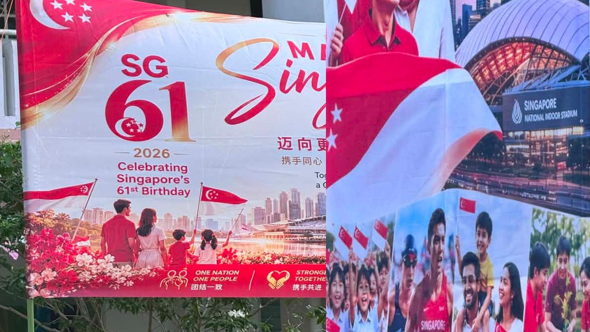

Kampong Chai Chee Community Club has responded to online criticism over an artificial intelligence-generated National Day banner displayed near Block 409 in the estate, after residents identified several apparent errors in its design,.
The community club said in a Facebook post on Tuesday, 21 July 2026, that the banner was created and funded by residents who wanted to mark Singapore's 61st National Day and bring festive cheer to the estate.
Many of the volunteers involved were elderly residents who gave their time and effort voluntarily, the club said. It added that they were not aware the AI-generated banner contained inaccuracies when it was put up, and that it was promptly replaced once the issue was flagged.
One flag on the banner had originally been printed with only red and white colouring, without a crescent moon or stars, closely resembling Indonesia's national flag. Another flag featured five stars, but they were four-pointed rather than five-pointed, with inconsistent proportions.
According to Lianhe Zaobao, the errors were first spotted on Sunday, 19 July, by an artist surnamed Xu, 46, who lives near the estate, according to the report. A separate vertical banner nearby, referencing the National Stadium, mistakenly rendered its English name as "Singapore National Indoor Stadium".
Xu, a former civil servant, told Zaobao that ensuring accuracy should have been a basic responsibility at each stage of the process, and questioned how the banner could have passed through design and review without the errors being caught.
The National Heritage Board's guidelines state that while the national flag can be presented creatively during the National Day period, its design should not deviate significantly from the original, so as not to alter its symbolic meaning.
Facebook thread documents a revision, and continued errors
The image was also widely shared and discussed on Facebook, where commenters questioned why the errors had not been caught before approval. "AI can be used, but still needs editing, can't blindly generate," one commenter wrote.
Later in the same thread, a commenter posted photographs of what appeared to be a revised version of the banner, prompting further scrutiny.
Another user asked whether the crescent moon and stars had been added by hand in reverse orientation, which a subsequent reply confirmed, calling the placement "weird" but technically correct.
At least one commenter said that despite the revision, "the other mistakes are still there." Others noted the banner lacked a consistent SG61 logo across its various panels, with one asking, "I don't think that's the official 2026 logo either."
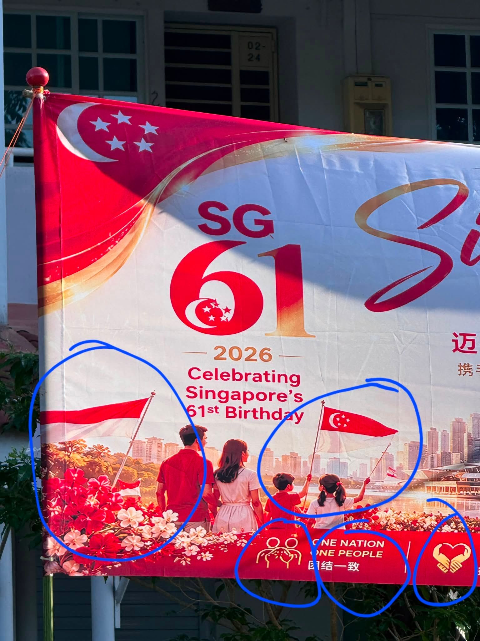
Several commenters questioned whether the crescent and stars were subject to specific design or brand guidelines, and whether the banner's design had breached them.
One user offered a rough cost breakdown, suggesting the estate might have saved on both design and printing by using AI, and argued that a smaller sum could have been spent on a human check before printing. Others in the thread pushed back, saying any savings would likely be outweighed by the cost of fixing the banner afterwards.
"AI is not at fault, it's the user behind the prompt that failed," one commenter wrote, a view echoed by several others who distinguished between the use of AI tools and the apparent absence of review.
Broader discussion of oversight and local creatives
The banner also drew extensive discussion on Reddit, where a post highlighting the errors gathered hundreds of upvotes and comments. Many commenters said the issue was not the use of AI itself but the apparent absence of review before printing.
"This is what happens when you use AI instead of real artists," one commenter wrote. Another asked, "who the f*** vet and approve to print?" A further comment read, "want to use AI also don't know how to review."
Several users pointed to additional visual inconsistencies beyond the flags, including what one described as a fictional skyline. A number of commenters argued that Singapore's creative community had been overlooked, with one writing that local artists would "willingly do NDP stuff for free because the exposure is unrivalled."
The apparent resemblance to Indonesia's flag also prompted lighthearted speculation among commenters on both platforms about a fictional merger between the two countries, with names such as "Singonesia" and "Indopura" suggested in jest.